Every screen, exactly as it ships.
These are the real app, captured from the release build at 390 × 844 dp. The theme toggle in the header switches them all at once — the captures exist in a light and a dark pair for that reason.
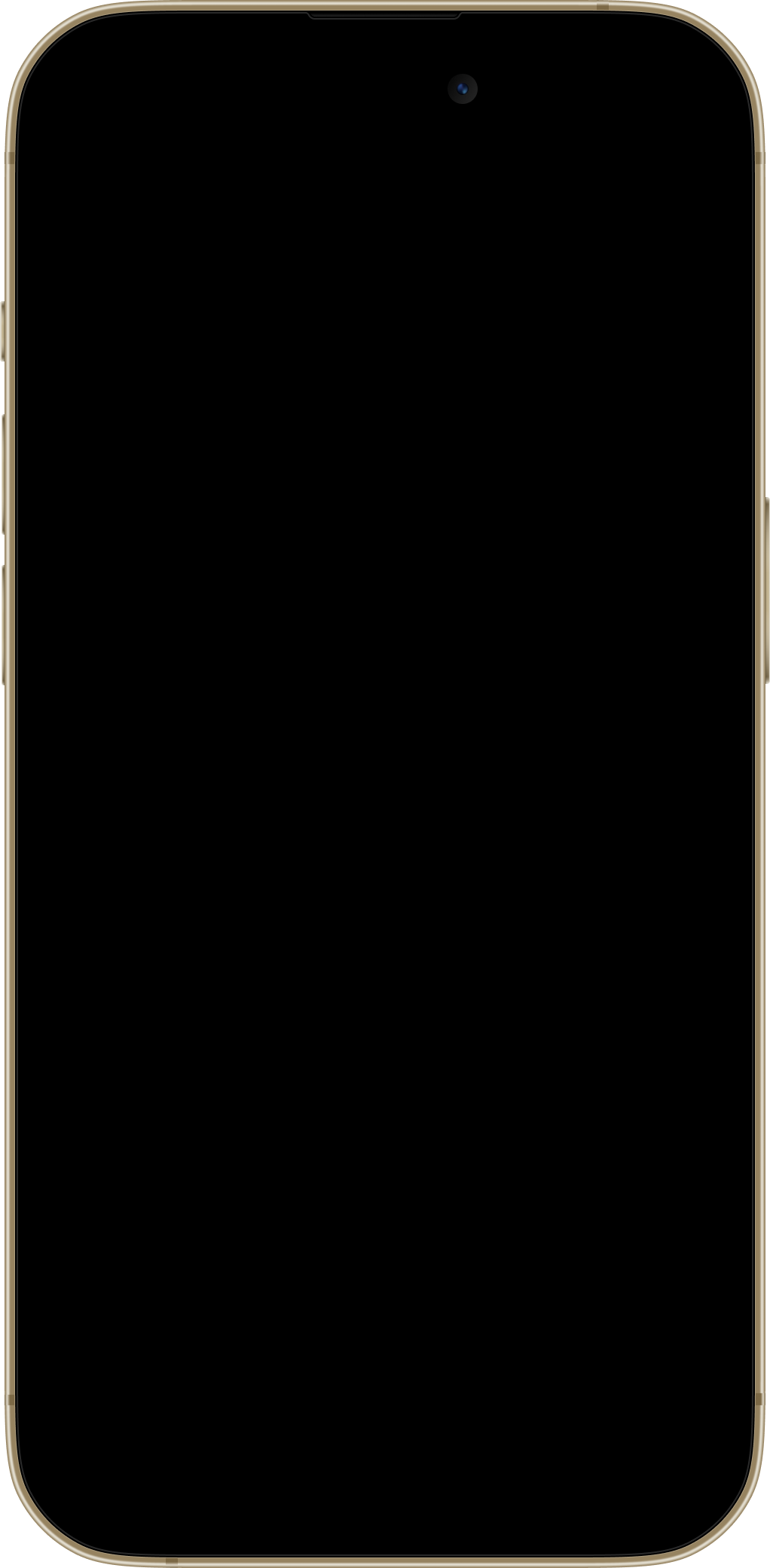
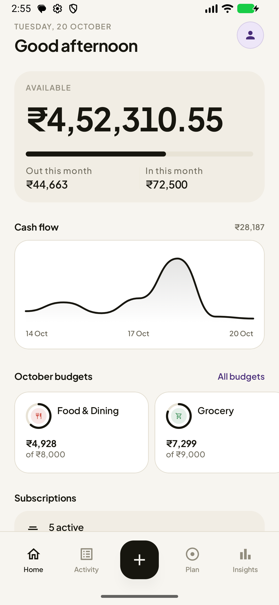
Balance, this month's flow, a seven-day strip, one budget aggregate, and the day’s transactions.
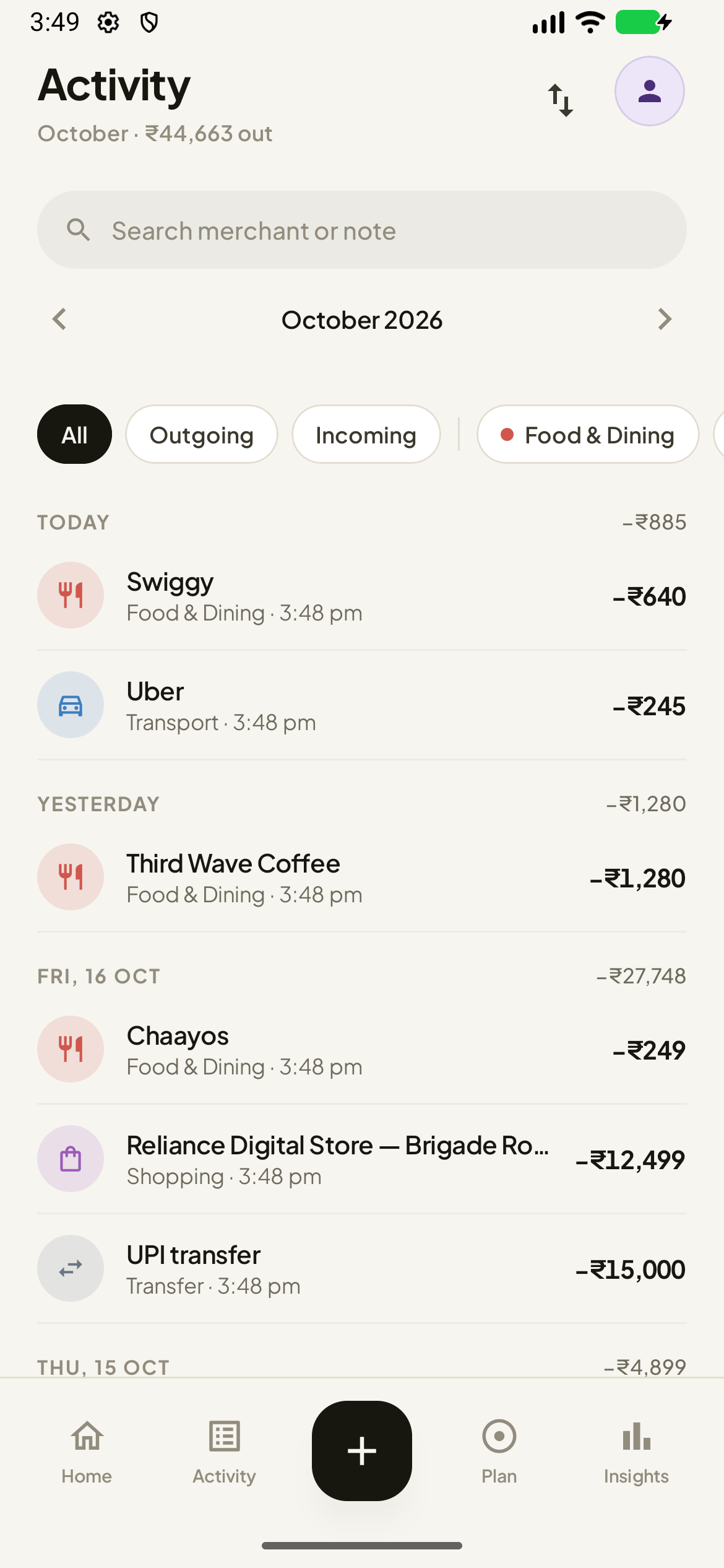
Search, filters, month navigation and a day-by-day ledger.
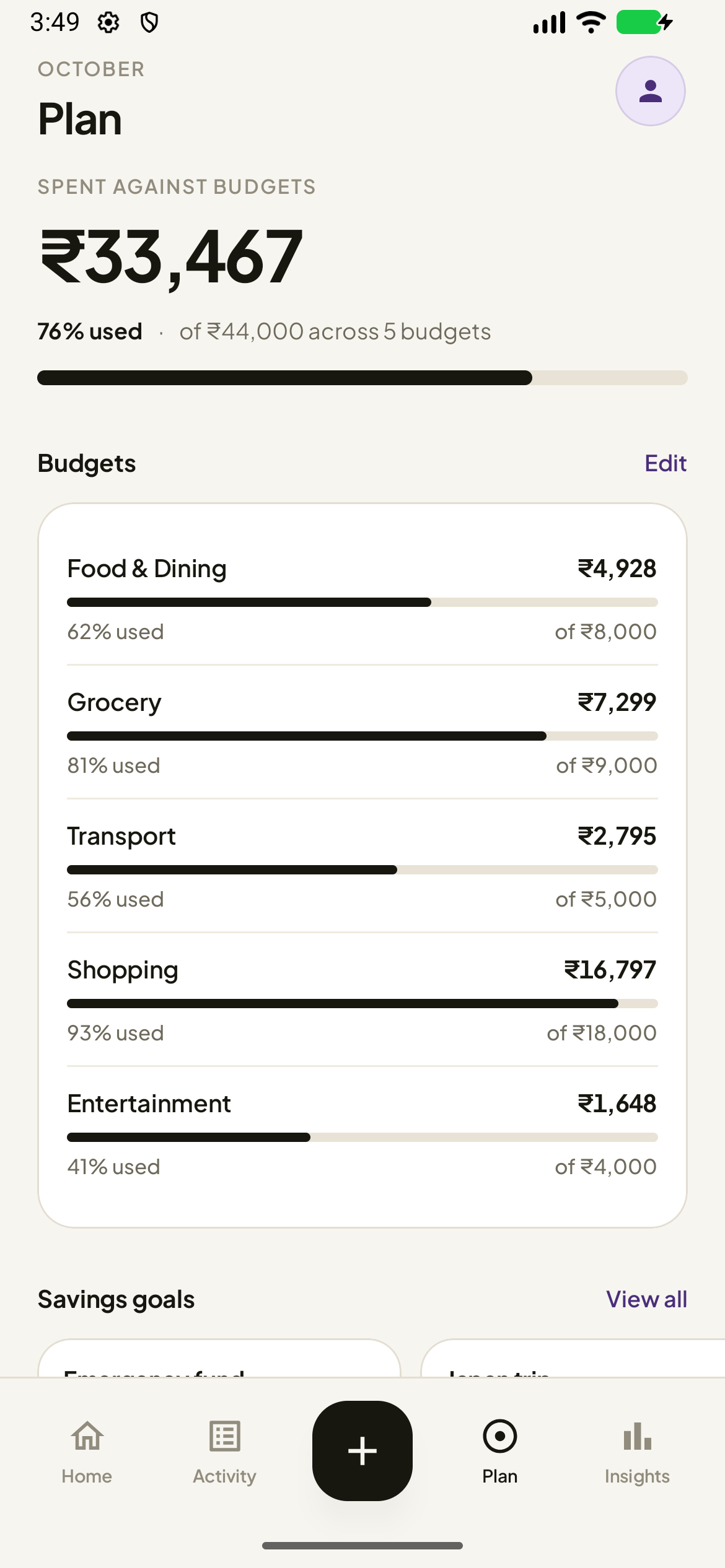
Budgets, subscriptions and savings goals, with the true percentage.
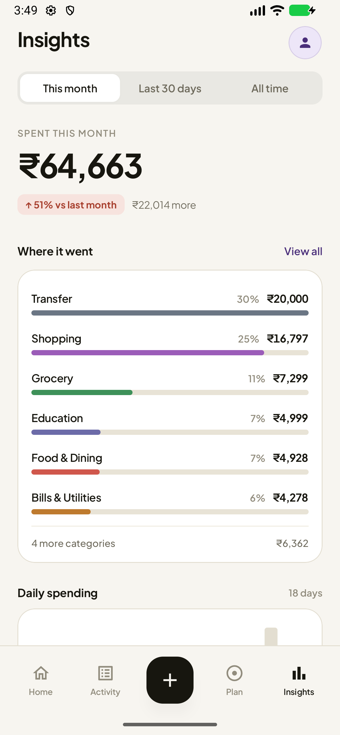
Where it went, how it compares, and who you spent with.
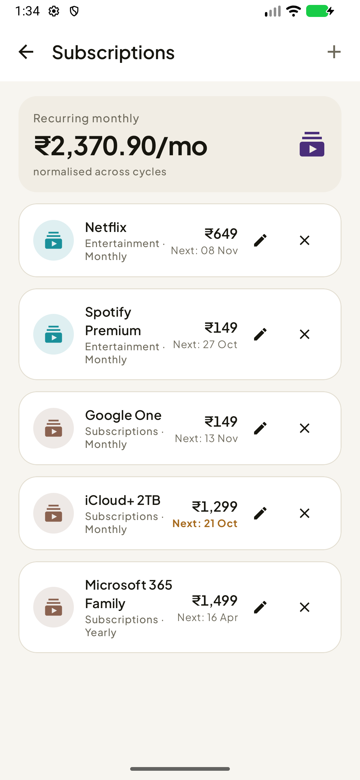
What you renew, and what AuraSpend has spotted in your messages.
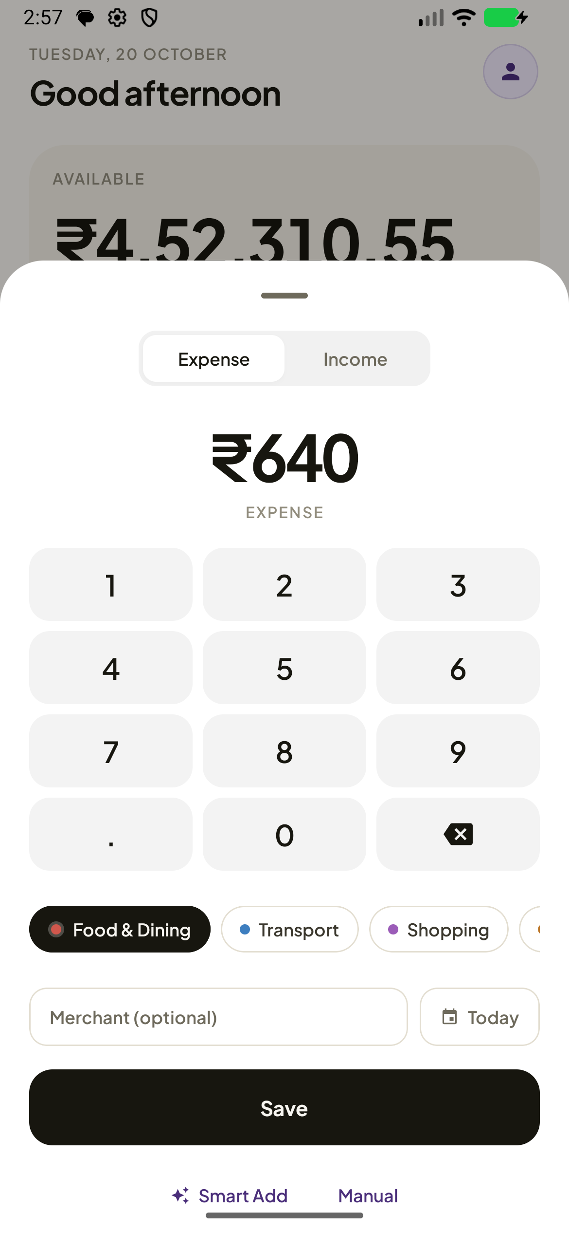
Amount, category, merchant, date — and Save, never below the fold.
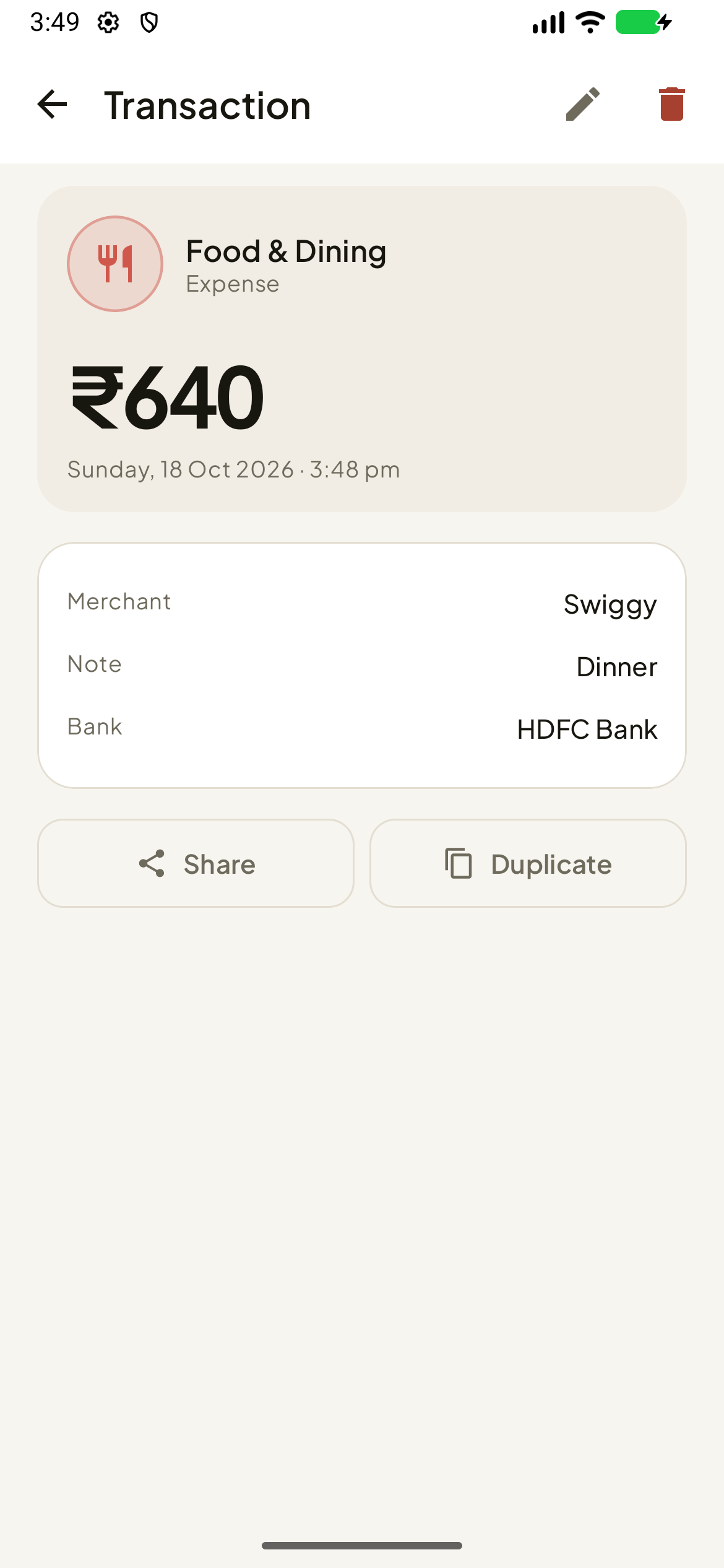
The original bank message, a copy button, and a tap to re-categorise.
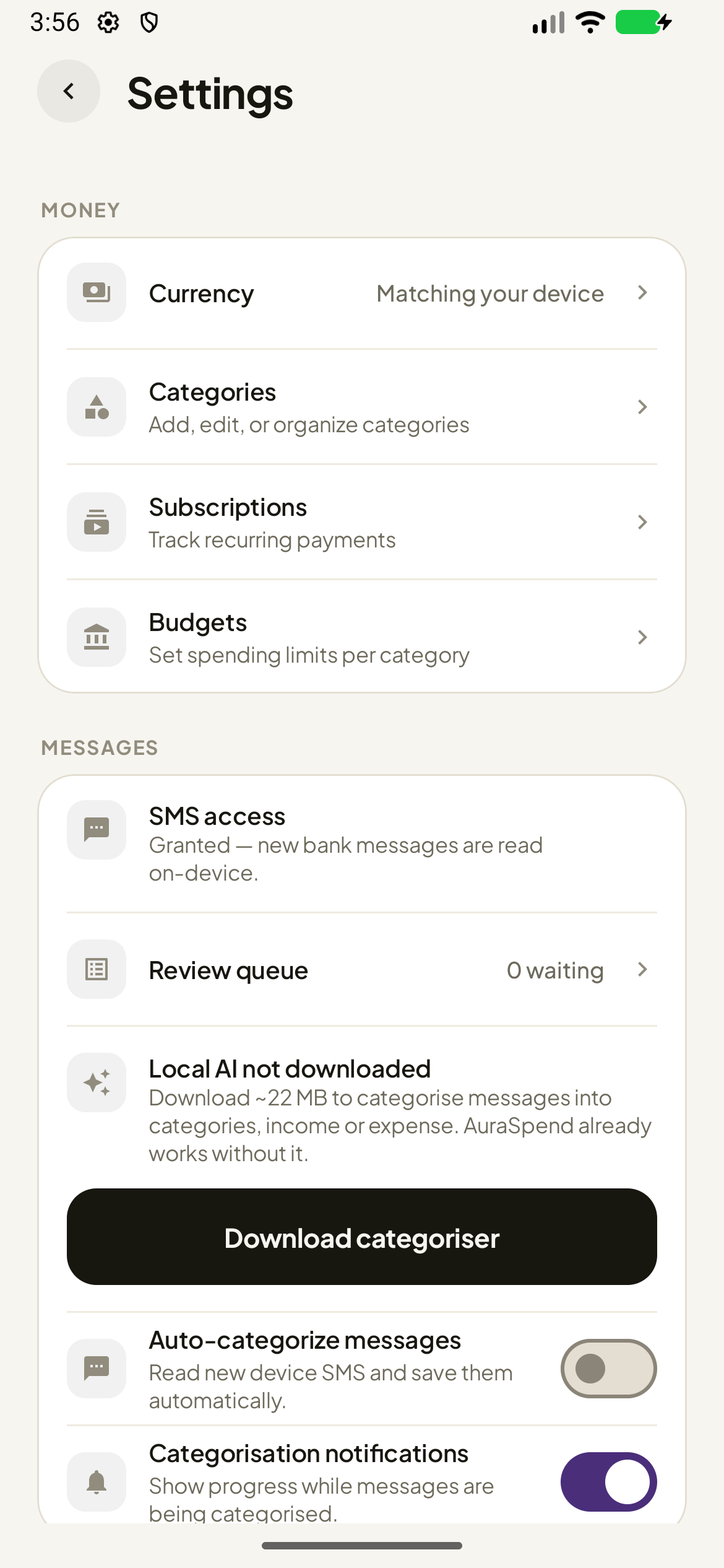
Money, Messages, Appearance, Data, About — and a review queue that tells you its count.
About these captures
They were taken on an Android emulator running the release build, with the app's locale set to en-IN and the screen at exactly 390 × 844 dp — the geometry of a typical phone. The numbers are demo data, and the demo data was chosen to be honest: a month that is going fine, with budgets between 41 % and 93 % used and nothing over.
The light and dark versions are the same app in the same two themes, so the theme toggle switches every image on this page at once. If you would rather see the app in your own hands, download it — it is about 41 MB.